2021-05-28 11:12
(Cover photo: Hydrological models — like this one showing where flash flood water would flow in historic Ellicott City in the US — are a powerful but underused tool for climate reporting. Image: Screenshot)
GIJN published the article "New Data Tools and Tips for Investigating Climate Change" by Rowan Philp:
For many data journalists, the tricky part of working with climate data is that much of it comes bundled together in multiple dimensions of time and space. For instance, each tiny grid square on a map can hold different information about temperature changes over time.
And this “gridded climate data” often appears exclusively in a file format called NetCDF, which is very different from spreadsheets, and unfamiliar to many reporters.
This is perhaps why several attendees at the recent NICAR21 data journalism conference pointed to a NASA data viewing app, called Panoply, when GIJN informally asked them to name the single most useful tool they’d heard about on the event’s opening day.
That’s saying a lot, because every session of NICAR — which stands for National Institute for Computer-Assisted Reporting, and is organized by Investigative Reporters & Editors — practically bristled with useful data tips and digital tools, as it has done since these annual conferences began in 1989.
In a virtual session titled Using Data to Report on Climate Change, BuzzFeed News science reporter Peter Aldhous showed how gridded NetCDF data files can be easily uploaded into the free Panoply tool, and how you can then use it to make customized maps for more accessible climate stories.
He was joined on the panel by NPR science reporter Rebecca Hersher and ProPublica environment reporter Lisa Song, who shared tips on little-known and niche data sources that can make climate stories both easier to report and understand.
Among their tips were ways to strengthen reporting on sea level rise, measure coastal sea temperatures, model future flooding, track hurricane damage, and customize climate data from around the world.
Hersher says the twin challenges of stories about sea level rise are, first, that many audiences don’t realize that ocean levels, and rates of change, are significantly different for local coastlines around the world, and, second, that reporters often don’t know how to find local sea level data.
She says an excellent source for local data can be found within the National Oceanic and Atmospheric Administration’s (NOAA) Tides and Currents Data Trends, which offers global data on local sea levels.
“This data is really easy to access,” says Hersher. “You can easily see, for instance, that sea level rise is a lot faster in Annapolis, Maryland, than it is in Santa Monica, California.”
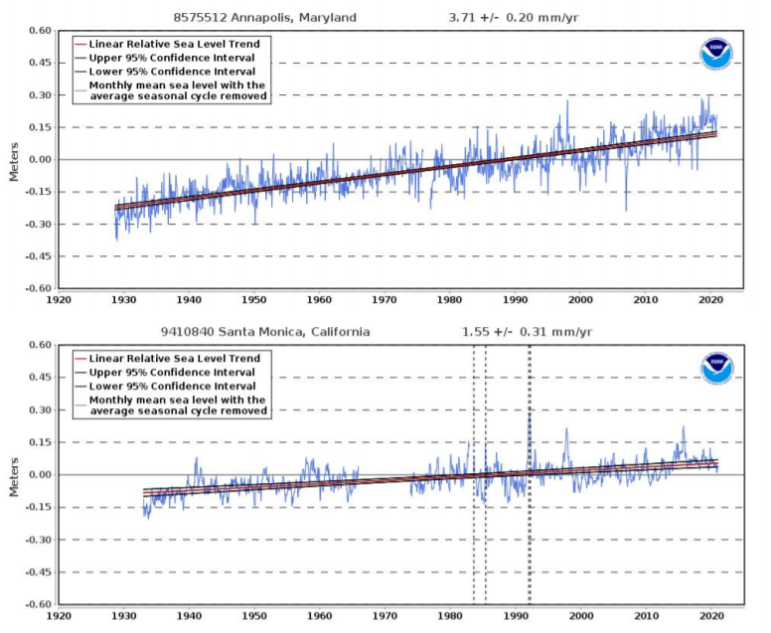
Data plots from the NOAA Tides and Currents database clearly show that sea level rise for the US East Coast city of Annapolis (top) has been much faster than the West Coast city of Santa Monica. Image: Screenshot
Hersher points to the Rising Waters series by South Carolina’s Post and Courier outlet as an “awesome” example of how to use NOAA’s localized data, and of climate change coverage in general. The data they found for the coastal city of Charleston showed that the local sea level rose 1.4 inches (3.6 centimeters) from 1990 to 2000; another 2 inches from 2000 to 2010, and a further 2.7 inches from 2010 to 2020. The story found that, as a result, the “nuisance flooding” — flooding at high tide — that happened about four times per year half a century ago now happens about 40 times per year in the city.
Hersher says reporters also find it “weirdly hard” to find good data on coastal sea surface temperatures. Although the dataset’s name doesn’t suggest it, the NOAA Coral Reef Watch site is an excellent — and underused — source of this data, she says.
“I think one reason people don’t use this resource is because it’s called ‘Coral Reef Watch,’ but it can be really useful for data not really about coral,” Hersher explains. “You can find what they call daily SST anomalies, which [are] temperature anomalies from normal for the top layer of the water, and in relatively high resolution. NOAA even makes their own gifs of this data that you can just download. I love the scale they use, which a second grader [can understand].”
Hersher used these datasets for an NPR story on the damage caused by the hottest year on record — 2020.
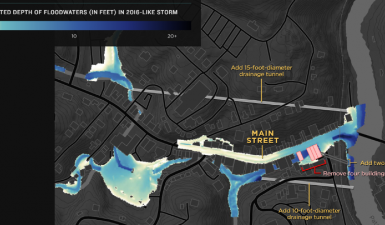
For local data and visualizations of flood planning, Hersher says she recently stumbled upon hydrological models — which are advanced computer models sometimes commissioned by local authorities to plan for things like flash floods.
“These are all about where water is going to go when certain amounts of water fall,” she notes. “They can be extremely helpful. The problem is you’ll never know these models exist unless you ask — maybe a planning or public works department, or a storm water agency.”
However, Hersher notes that many officials are glad to share hydrological model data with reporters simply because they are expensive to commission, and there is value for them in seeing it fully utilized.
NPR used these models for a major story about flash flood planning in historic Ellicott City in the US state of Maryland.
Although ProPublica’s Lisa Song offered the NICAR21 audience datasets specific to the US — such as the USGS Streamgaging Network, and the National Flood Insurance Program from the Federal Emergency Management Agency (FEMA) — her tips on how to target lesser-known climate data sources could be useful to journalists in many countries.
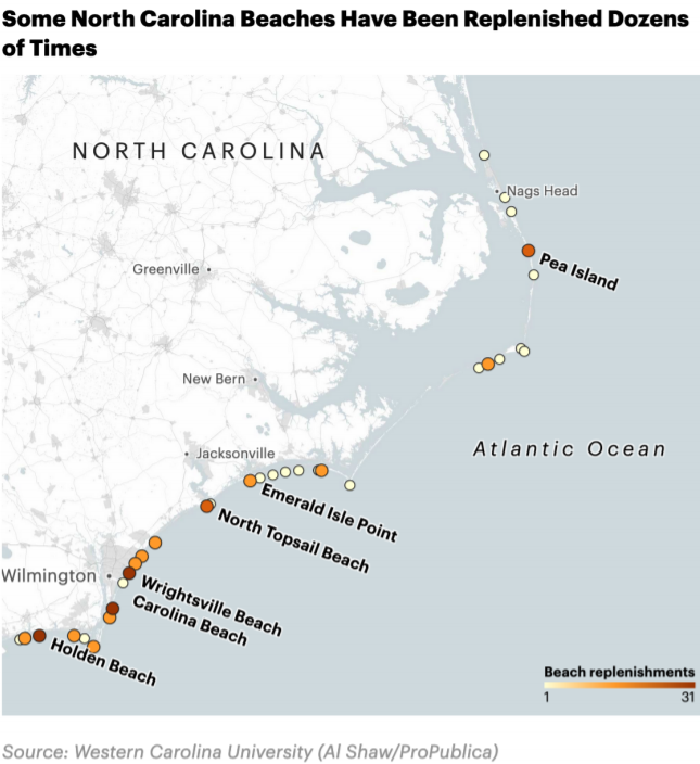
ProPublica was able to show both the damage, and cost, of increasingly potent hurricanes by using a niche dataset that counted truckloads of sand to replenish beaches. Image: Screenshot
To illustrate how prevalent NetCDF files are in climate science, BuzzFeed’s Peter Aldhous did a search of one major climate science source — the National Center for Atmospheric Research Climate Data Guide. He found that 134 of the archive’s 214 total datasets were presented in the NetCDF format.
He says these files often show both information and time periods for each map grid cell, such as 2 degrees latitude by 2 degrees longitude. For instance, he notes the NASA GISTEMP analysis publishes surface temperature information for these hundreds of grid squares monthly — for the whole planet — with the archive going back to 1880.
“If you’re familiar with spreadsheets and databases, NetCDF is probably a weird format to think about working in — that dimension of time and two dimensions of space,” says Aldhous. “But there is software to make it really easy to look at this format — Panoply. It’s multi-platform — you need Java on your computer, but otherwise that’s about all. You can download it easily, and start running it.”
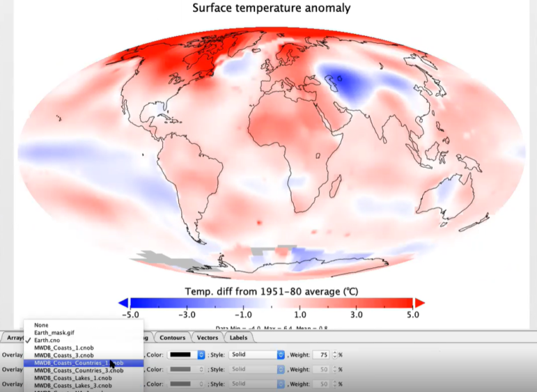
In this workshop example, the NASA Panoply tool processes global temperature anomalies over three decades from a NetCDF data file. Image: Screenshot
Once you’ve opened a NetCDF file in Panoply, Aldhous suggests that you:
“It’s pretty easy to use, and it allows you to access the raw data on things like sea surface temperatures,” Aldhous explains.
For reporters with some coding experience, Aldhous recommends processing gridded climate data in the Raster package in the R programming language.
“I do most of my climate work in R, and I use the Raster package — it’s incredibly powerful for working with this data,” he says. “I hope those who have worked with code will look at this package and think ‘that doesn’t look too scary.’”
Interested in more from NICAR21? The full schedule can be seen here, and recorded sessions can be accessed and viewed until March 2022 via this link. You will need to register.
Climate Change: Investigating the Story of the Century